Law School Transparency
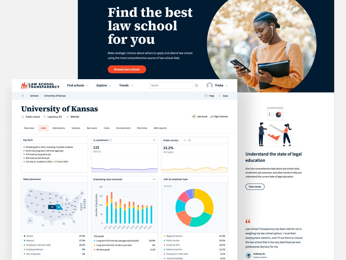
See liveLaw School Transparency is a tool that helps pre-law students make strategic choices about where to apply and attend law school using the most comprehensive source of law school data.
As a frontend engineer and designer, I redesigned the whole website, refactored the frontend (from jQuery to Vue, Bootstrap to Tailwind), nearly doubled clicks on Google, implemented numerous UX improvements, and more.
Here's a brief summary of what I've done in my year and a half working on LST.
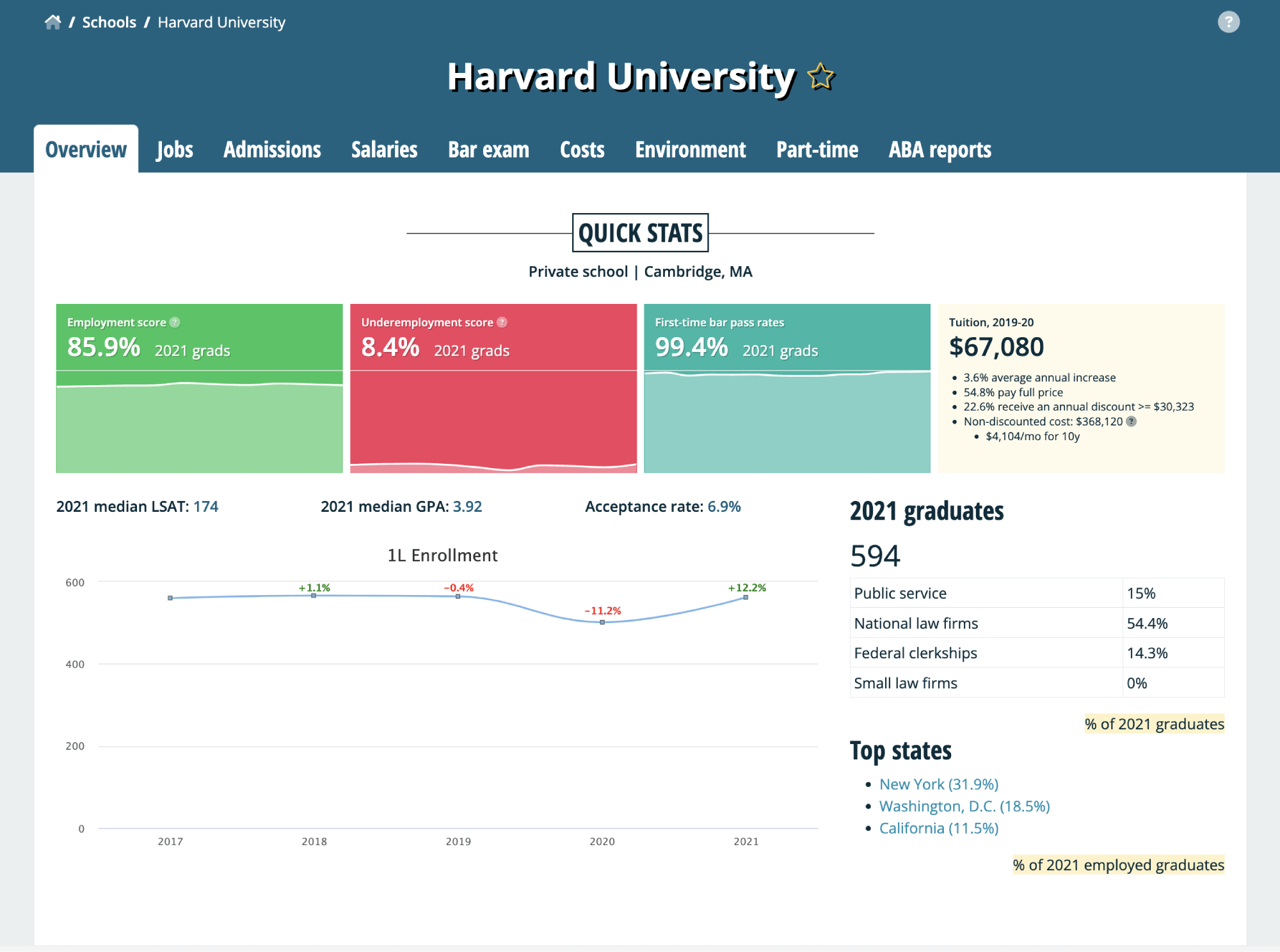
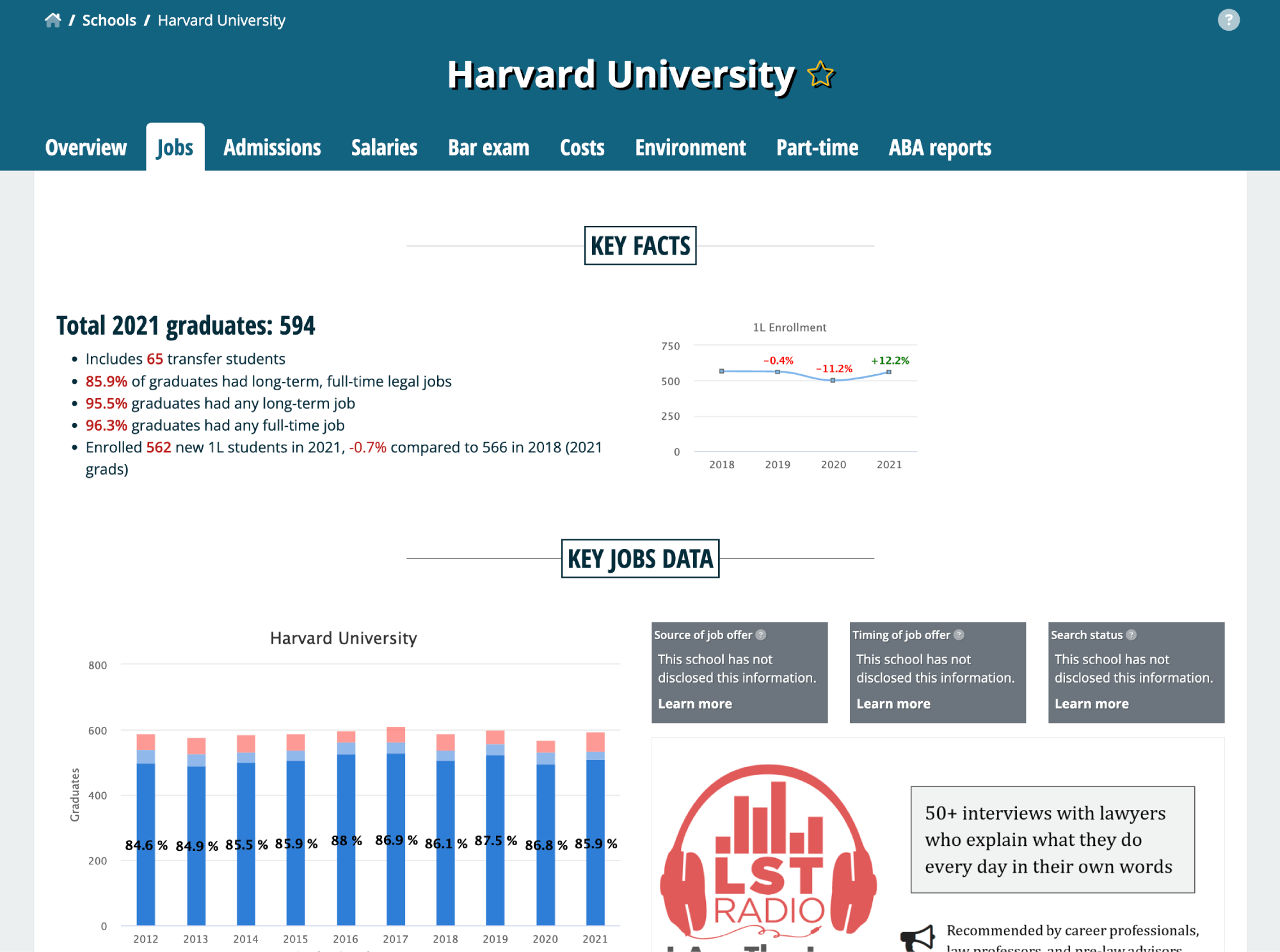
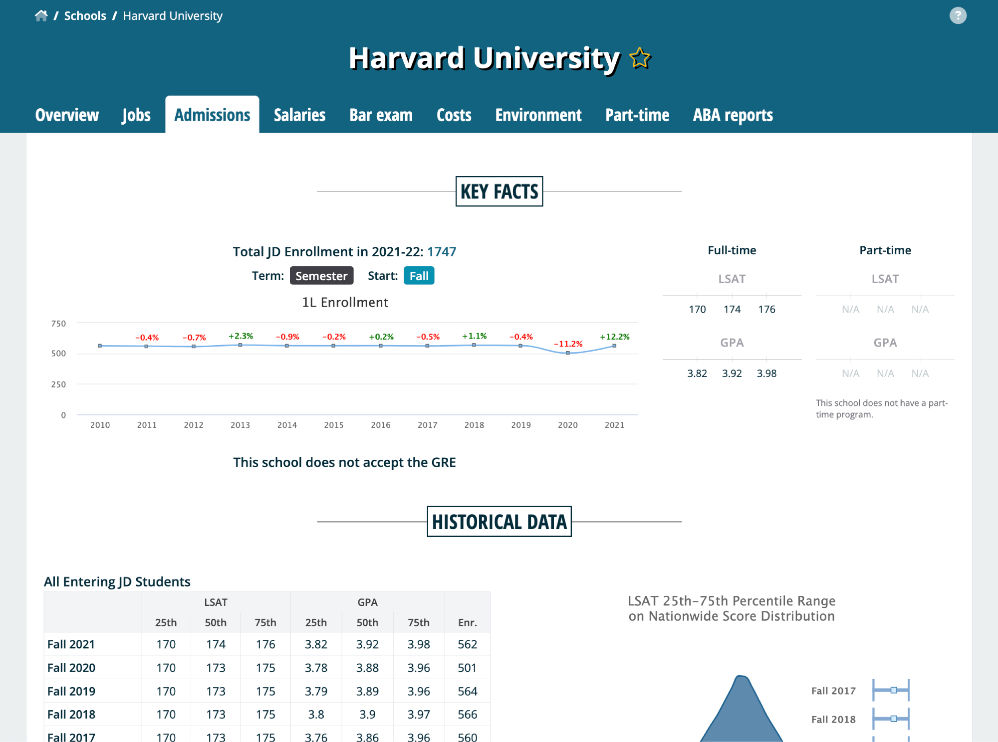
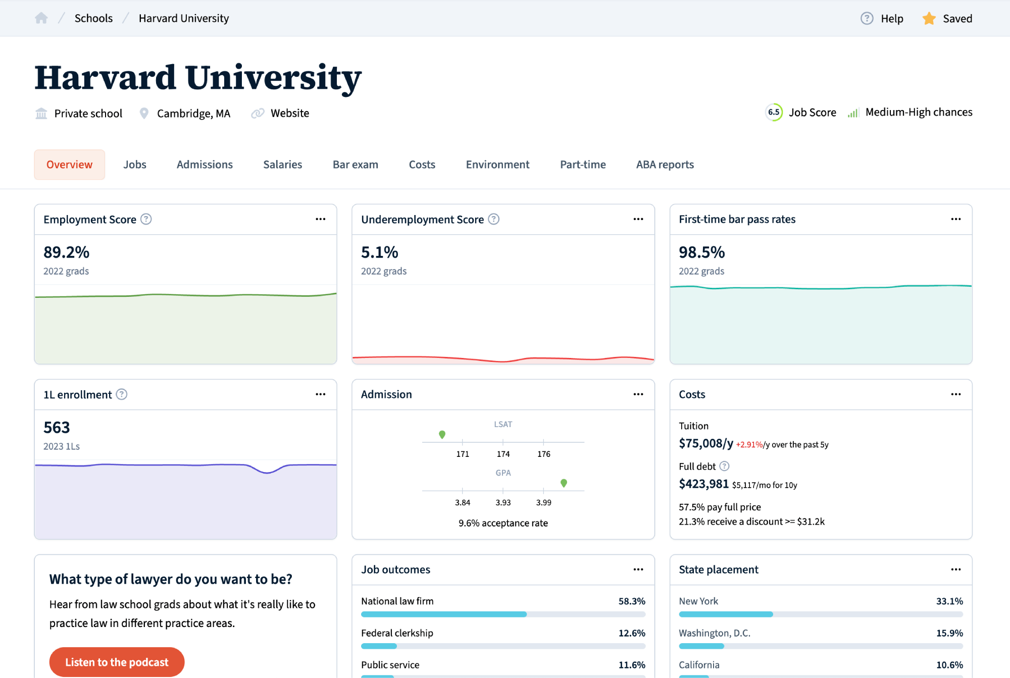
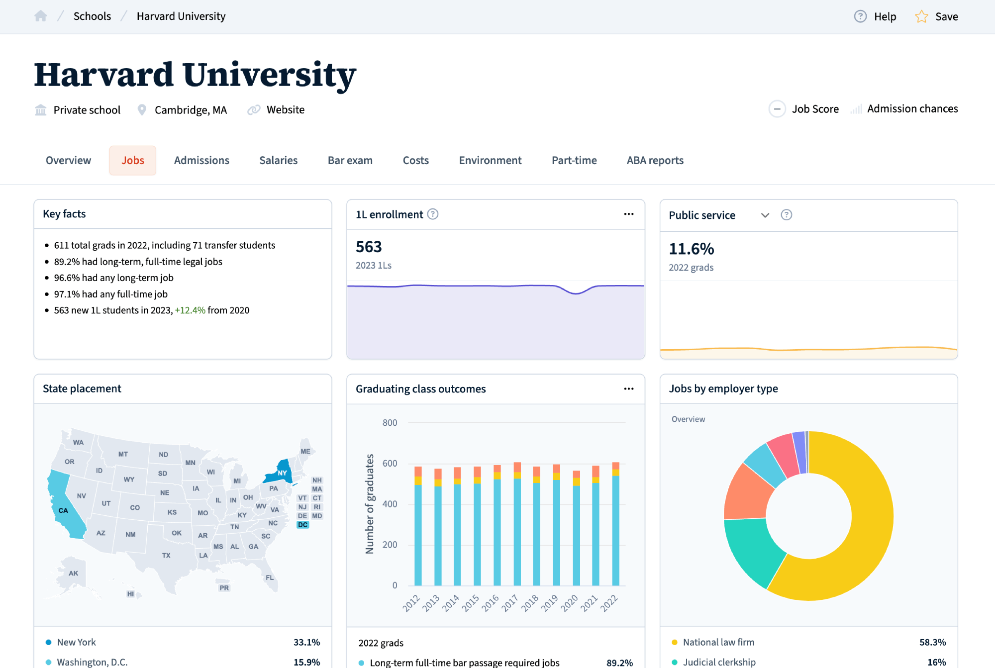
School profile redesign
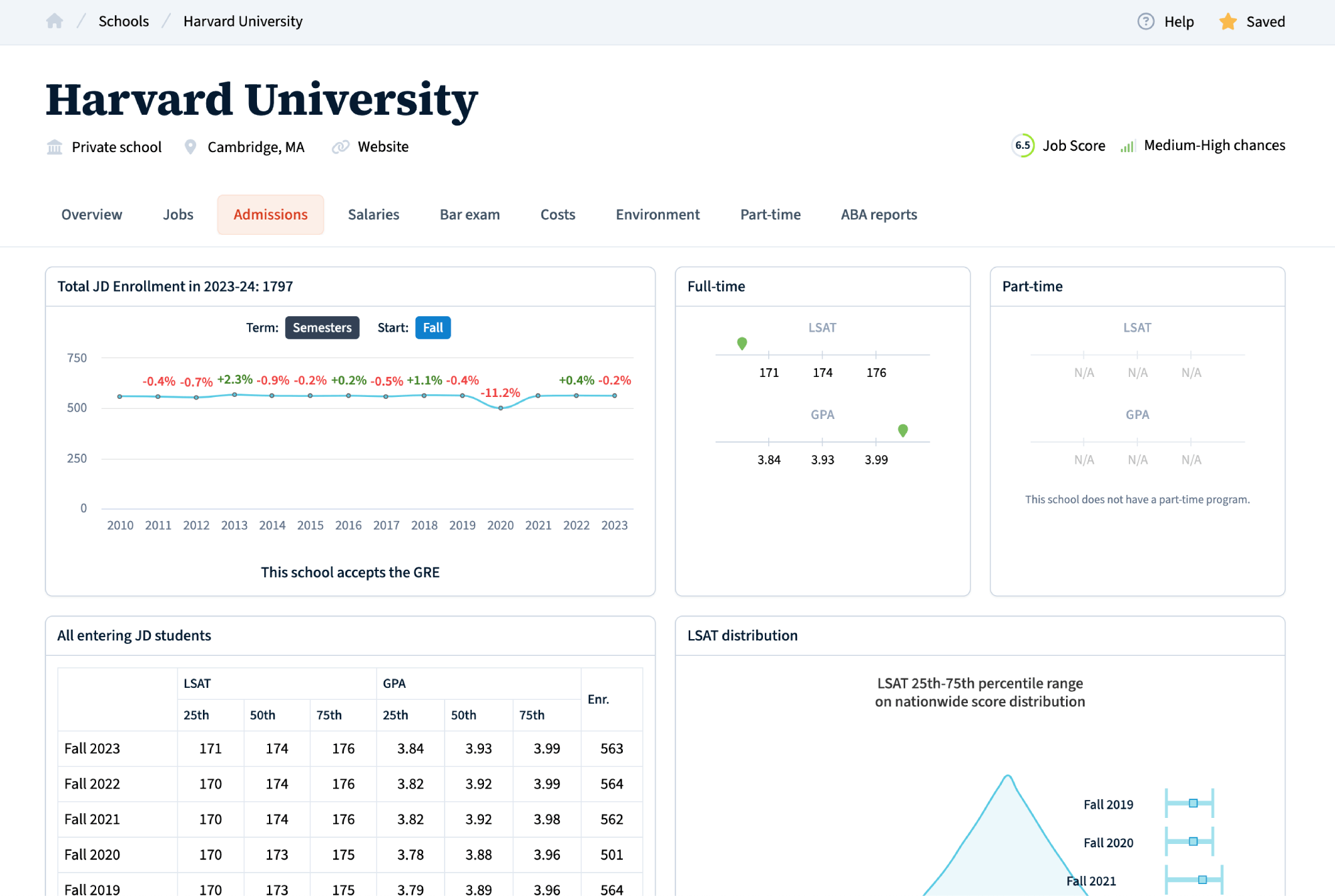
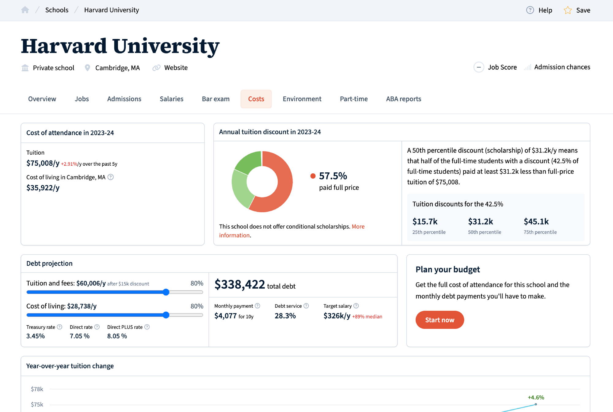
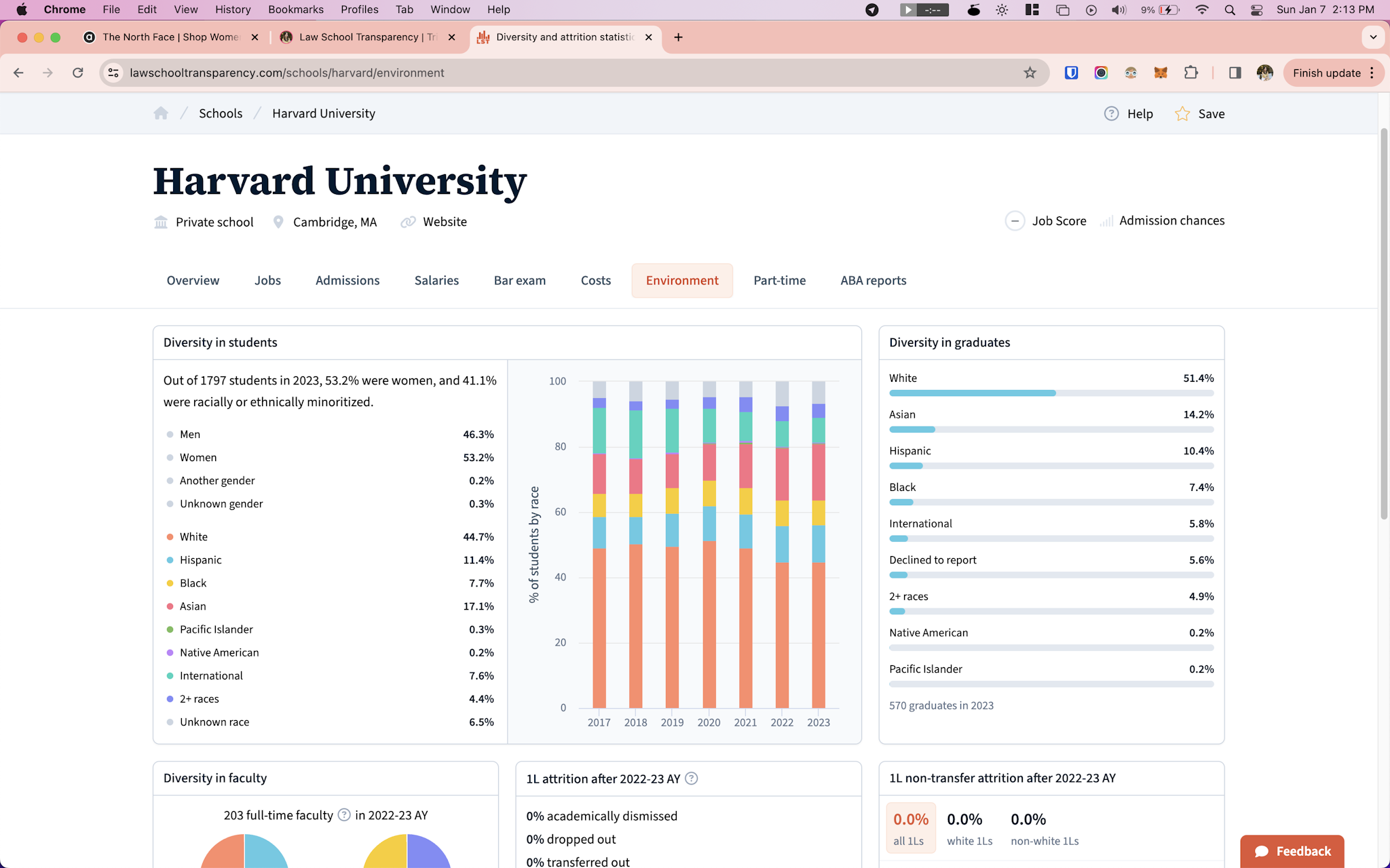
LST has over 10 years of data on each law school regarding enrollment, employment, admissions, job outcomes, salaries, costs, and debt.
How can I present this data in a way that makes it meaningful, and helps students achieve their goal of finding the right school for them? I simplify and prioritize for the users that are easily overwhelmed or just want a quick summary, but I also dive into the statistics in detail for those that want to know more.
I shared my process in more detail here.
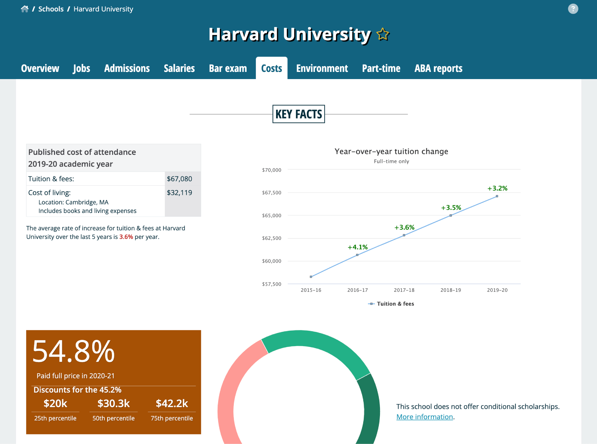
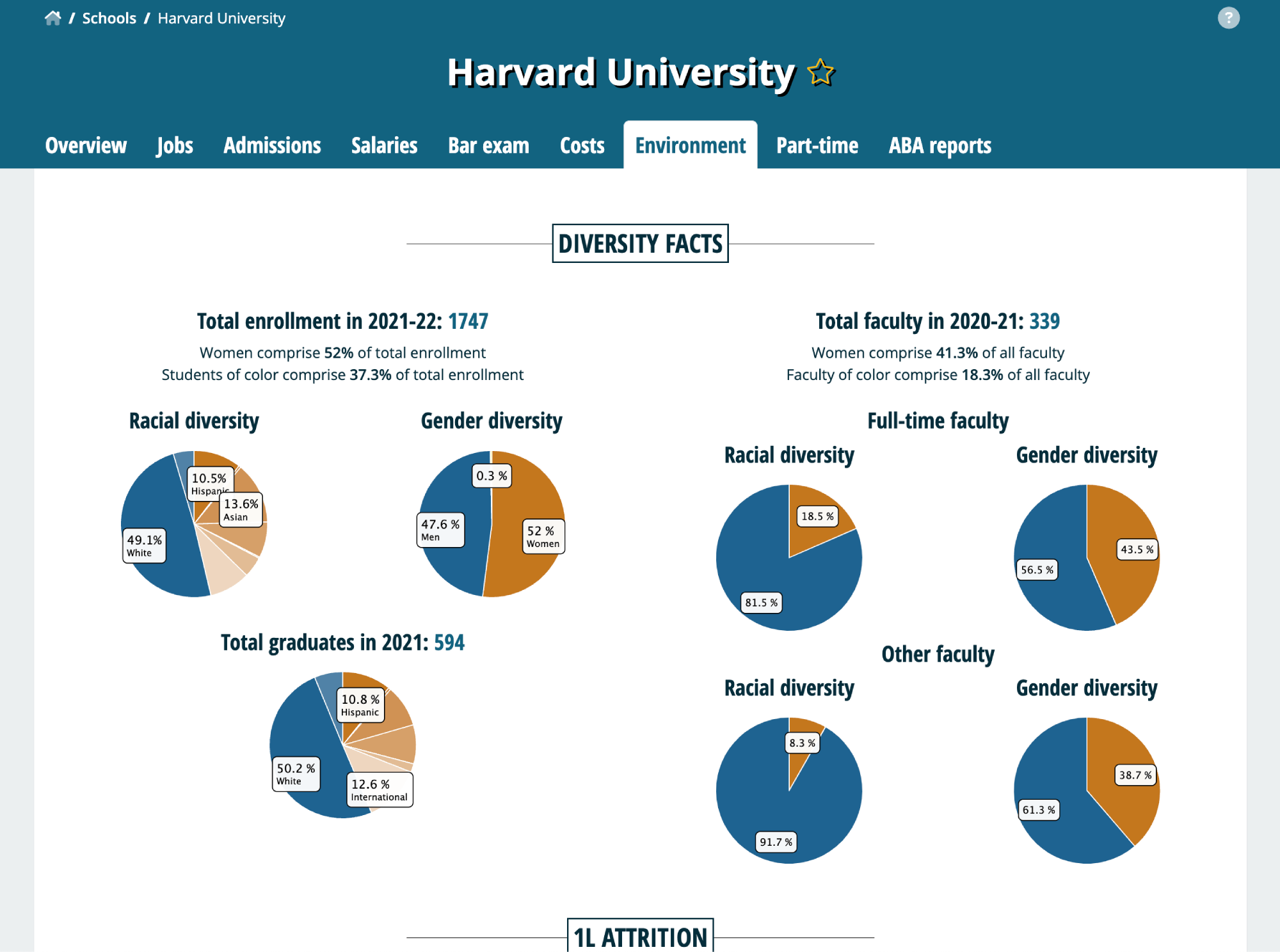
Before
After
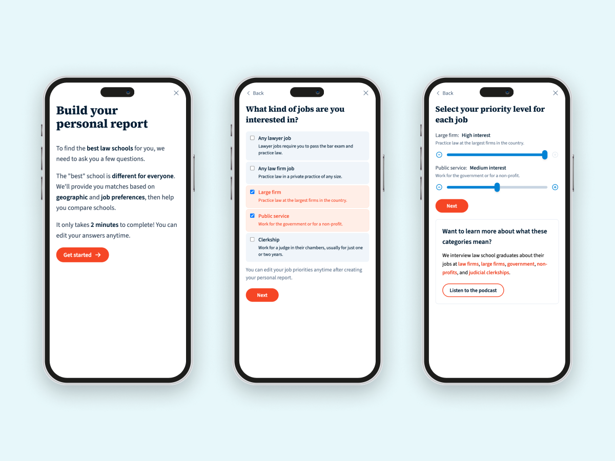
An onboarding questionnaire for personal report
Our main goal is to help prelaw students find law schools that are a good fit for them. Going to the right school is a crucial decision in their legal career, because it determines what kind of work they can do after graduation, and which states they can work in.
The tool that covers all those factors is called the personal report, and that's where we want to lead users to.
I created an onboarding questionnaire to lead users step by step in creating their personal report.
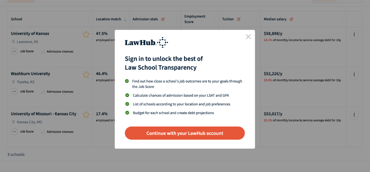
A login popup to promote signups
There are tools that require users to be signed in, including the personal report. I created a component that wraps buttons that trigger an action for logged in users only. Instead of performing the action when the user is not logged in, it shows the popup instead.
A debt calculator to replace block of text
Before
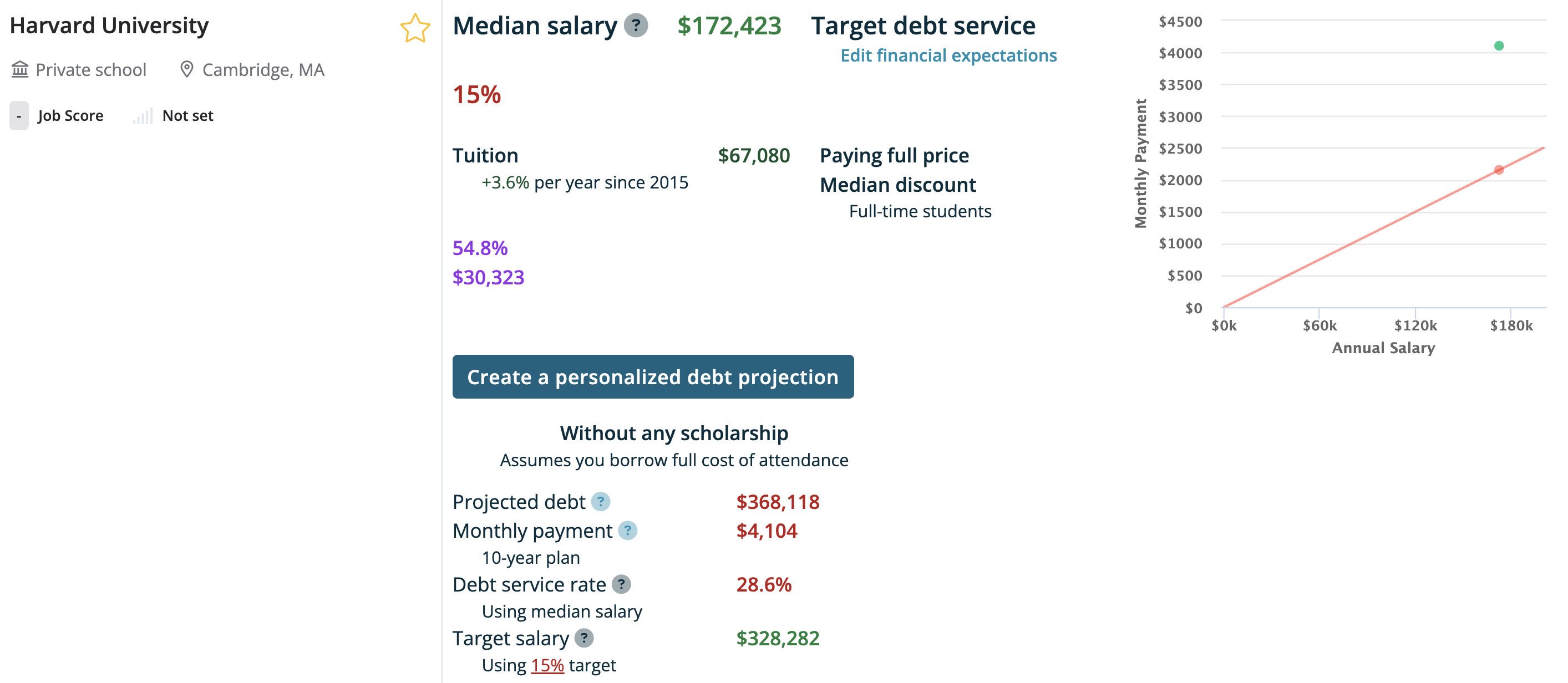
After

Home page redesign and rebrand
Before
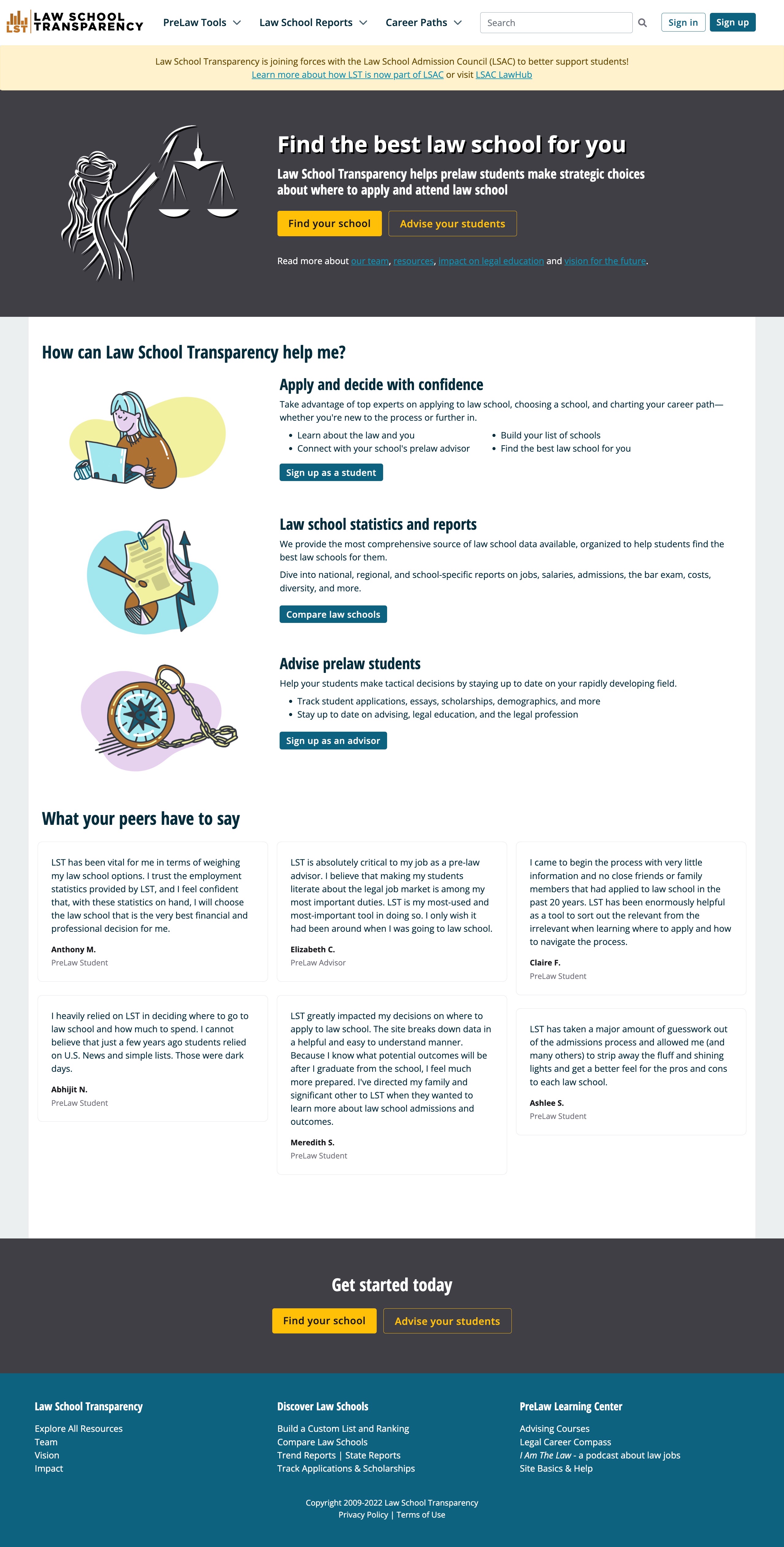
After

Shipped a complete redesign of Law School Transparency last week as @LSAC_Official bring it in under the LawHub brand 🔥@trishathecookie has done an amazing job implementing the new brand guidelines 👏https://t.co/PSl4Edt2QE
— Steve Lacey 🔥 (@stevelacey) January 31, 2023
References
Trisha led the frontend development on one of my projects for over two years, overseeing a full website redesign along with various iterative improvements, new features, and rewrites.
She didn't just code; she developed a deep understanding of our target users, making complex data easier to understand for everyone. Her proactive approach and ability to simplify complex visualizations were game-changers for the project.
Trisha is a talented frontend engineer, designer, and strategic thinker. Any team would be lucky to have her.

As lead frontend engineer and product designer, Trisha thought deeply about user needs, and onboarded a tremendous amount of information about law schools in the US. Using this knowledge, she made major improvements to our website, especially with simplifying complex data in charts and tables, making it more consumable for users.
Trisha really brought our mission to life in a way it never was before. Frontend engineers are great, but frontend engineers who are also big-picture thinkers are indispensable. I wish I had her help years earlier.


