Do this before optimizing your Lighthouse score
May 16, 2022 • 4 min read

What is Lighthouse?
Lighthouse is a tool for measuring page quality that gives you tips and recommendations in improving user experience. It gives you a score of up to 100 based on performance, accessibility, best practices and SEO.
Is it really that important?
It's easy to fall into the trap of optimizing your Lighthouse score and trying to reach 100. It's satisfying to make small tweaks to your code and see that number go up and turn green.
It's easier to optimize what we can quantify. That's why we measure career success with salary and net worth, rather than job satisfaction and freedom. It's the same for school and some people's (🙋) obsession with grades. Don't confuse the metric (Lighthouse score) for the goal (good user experience).
If Lighthouse tells you that you have some major issues on your site, sure, go ahead and fix it. But focus on the goal. At a certain point, there are other things you can do for your site that have much higher impact than getting your score from 90 to 100.
Lighthouse scores of successful websites
Overengineering distracts you from the most important things. Let's go over some famous websites and their Lighthouse scores.
1. RemoteOK - a directory of remote jobs, making over $2M/year

2. Upwork - the world's leading marketplace for freelancers

3. Web3 Career - the #1 result when you search "web3 jobs" on Google

Instead of optimizing your Lighthouse score, ask yourself these questions.
Does your site work well in all breakpoints?
We usually design for desktop first. Chances are, you have a high percentage of mobile users, as we're on our phones all. the. time. So don't treat your mobile experience as an after thought. It might even be more important than desktop.
What's the goal of your website, and is it designed in a way that makes your users do what you want?
This is called a call-to-action (CTA). Whether it's a portfolio site, landing page, e-commerce or SaaS, you should know what you want your users to do before leaving, like:
- For a portfolio website, you want leads to contact you and discuss potential work.
- For a SaaS landing page, you want users to sign up for a free trial.
- For a blog, you want users to subscribe to your newsletter.
Make your CTA loud and clear by:
- Making your CTA buttons stand out.
- Writing copy that leads users to click those CTA's.
- Having a CTA section at the bottom, which users see after they've read and understood what you're offering.

What do my pages look like when shared on social media?
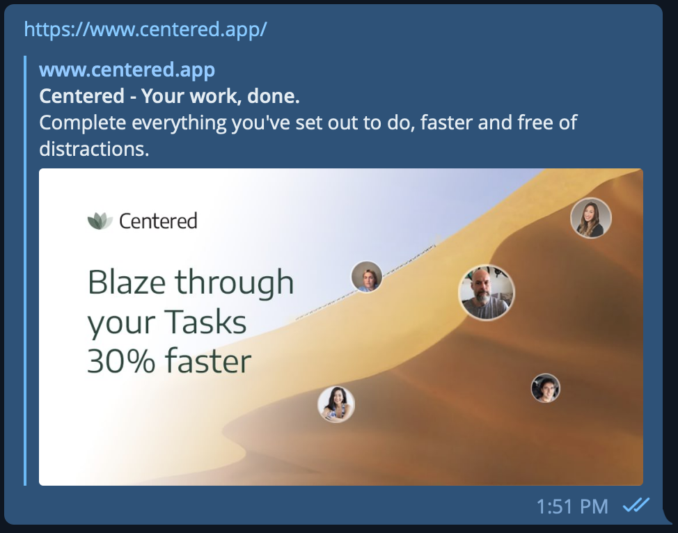
You've written an awesome blog post. The content is absolutely 🔥. This is gonna bring a lot of value to your readers. Then you share the link on Twitter and the preview looks nothing like the blog post you were trying to tell everyone about. 👎
Make sure you have your meta image, title and preview right. Test them on Facebook and Twitter.
What can you do to make users click throughout your site and go to different pages?
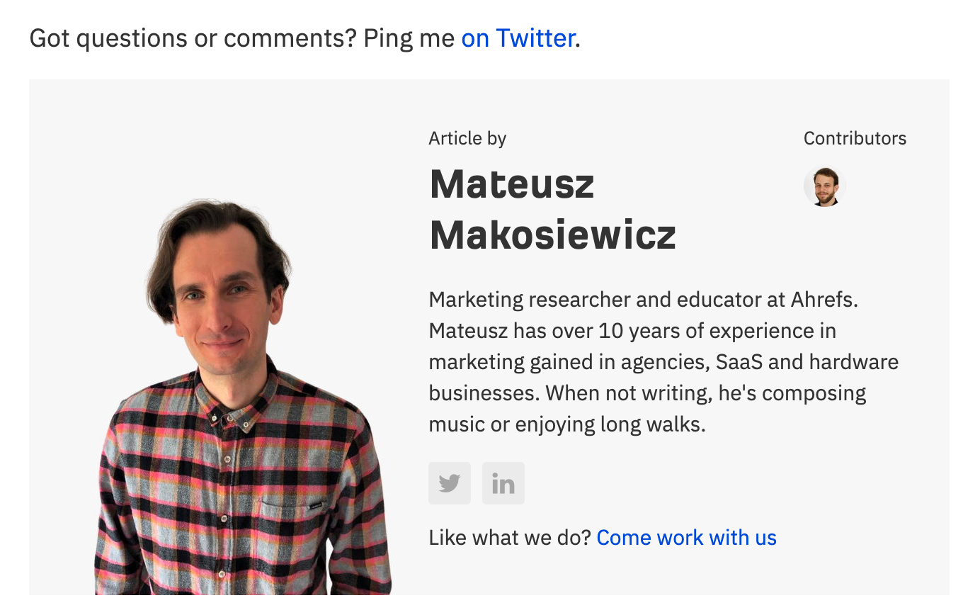
Once you get somebody to a page on your site, take advantage of it and make it easy for them to navigate to other pages. Here are a few examples:
On each blog post, talk a bit about yourself and add relevant links to get to know you more.
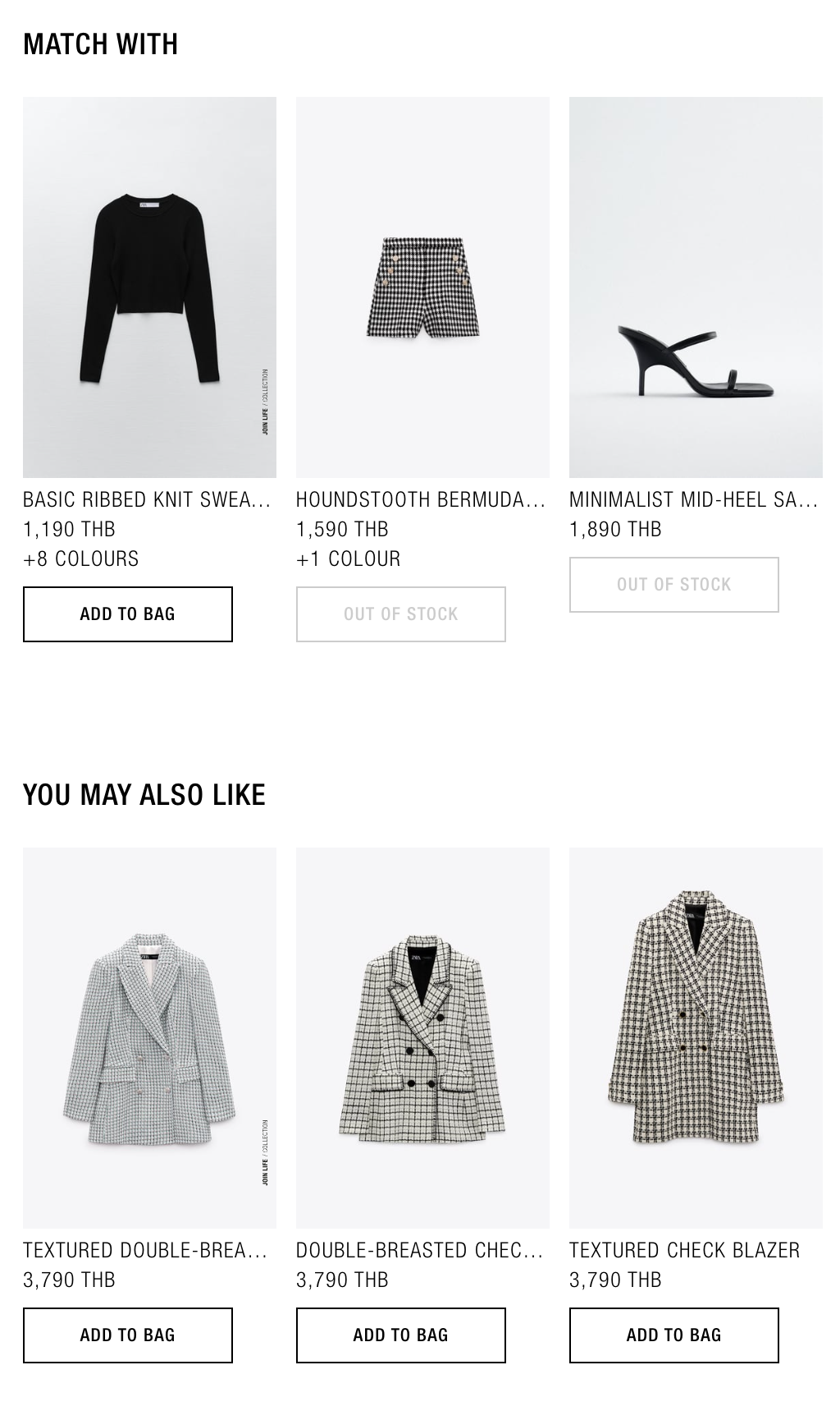
For products or projects or blog posts, show related content that says something along the lines of: "You might like this.."
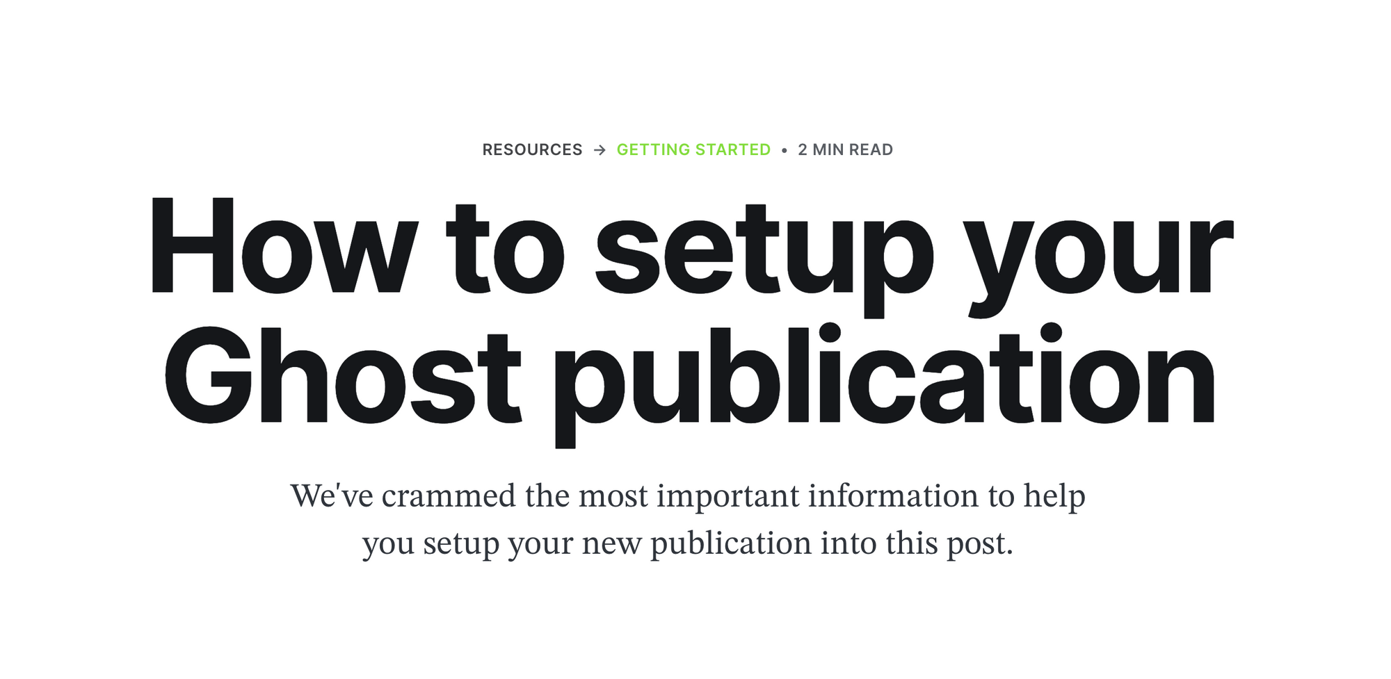
Breadcrumbs to go back to pages up the hierarchy.
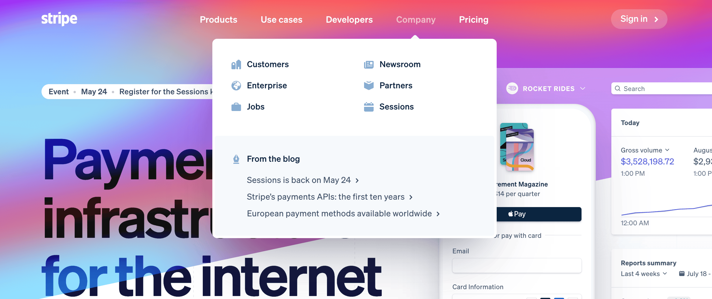
Mega menu for a high level overview of your site.
Summary
Lighthouse is a great tool to detect problems with your site, and they tell you what you can do to fix those problems. That's great, but don't get stuck overengineering. Think about what other tasks you can work on that have higher impact.

