5 actionable steps to becoming a better frontend developer
Mar 24, 2022 • 5 min read

Writing code and building a user interface that does what it’s supposed to do makes you a frontend developer. When you’ve delivered features, then you’ve done your job.
If you're aiming for "good enough", then you can stop here. But if you want to stand out, go the extra mile and delivery high quality work, then follow these steps.
1. Write reusable components. Duplicate code leads to inconsistency.
Sometimes you think to yourself, "It's only a few lines. I'm just gonna copy and paste this because creating a new component takes time." Then you end up with problems like:
- Some buttons have a hover effect, and some don't.
- Your borders are using a different shade of gray.
- The spacing between your button label and icon are just a tad bit different.
Doesn't sound like a big deal, right?
You'll have these minor inconsistencies everywhere. They add up, and you'll end up with a website that just looks "off" and not clean.
2. Create a style guide.
💡
A style guide is a documentation of your website design. It includes a list of components and their variations, typography styles, icons, color palette and anything else being reused. It helps you achieve a consistent look throughout your site.
If you already created reusable components, but you don't know what components already exist, then what's the point? You'll end up with different versions of the same thing anyway.
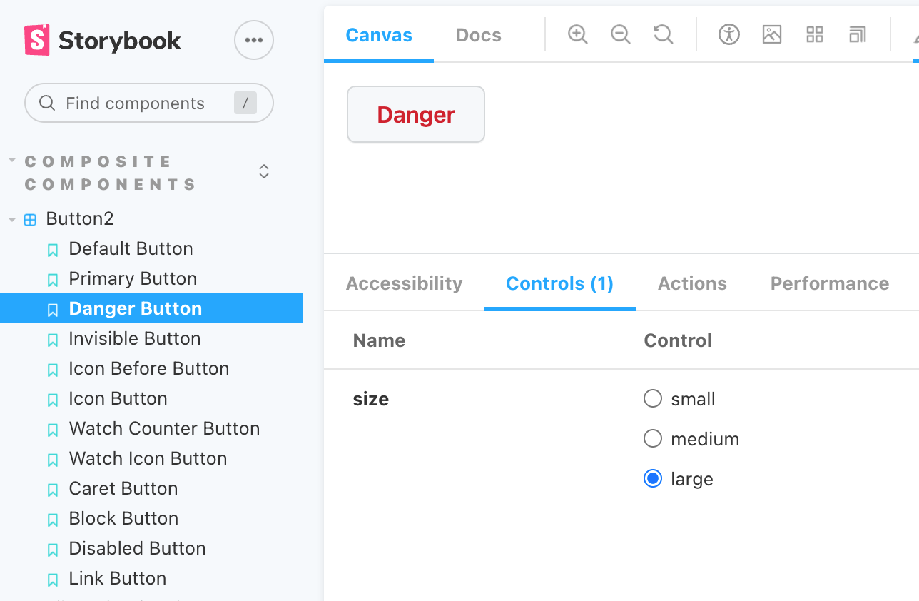
You can make it 100% your own like Starbucks, or you can use Storybook to speed things up. Storybook lets you change the parameters to your components through the UI, and you don't have to spend time designing your own pages.
Here's a peek at GitHub's different buttons. You can view the different sizes too. GitHub's Storybook is public, along with many others.

3. Pay attention to spacing.
If you're being told multiple times by designers to "move this 5 pixels to the right". Don't roll your eyes 🙄. They're asking you for good reason. A few pixels might not seem like a big deal, but it could be the difference between something looking "off" and just right. Remember, the small things add up.
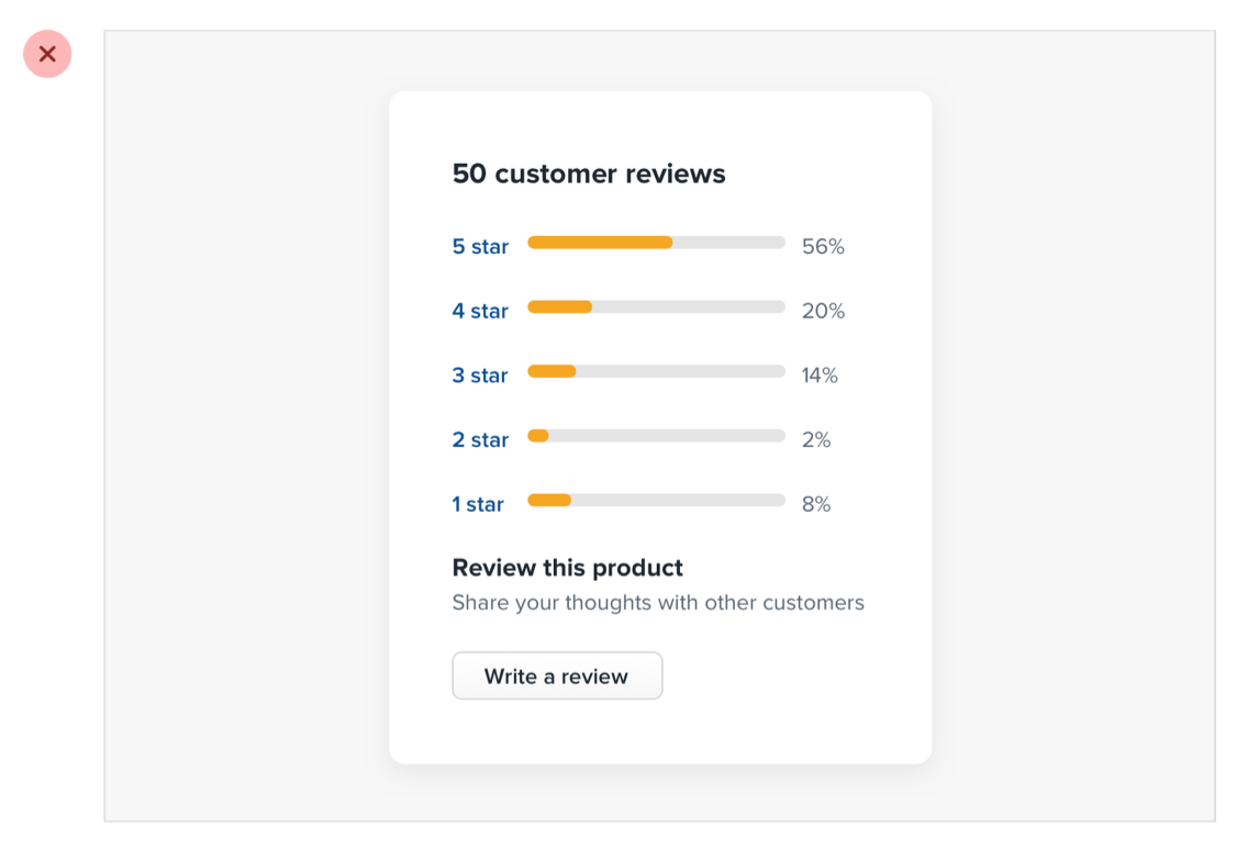
Here's an example from Refactoring UI about bad spacing vs good spacing. In this example, there is too much space between elements. You might also end up with the opposite and get things too cramped up.

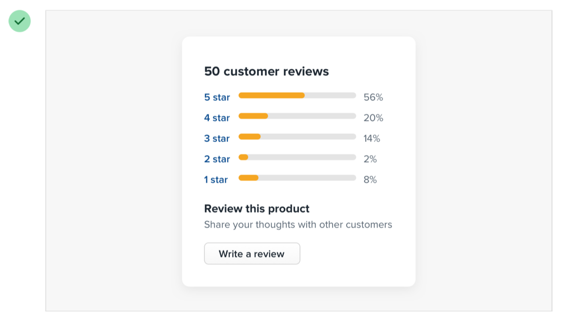
Here's an improved version. Much better!

The ratings are grouped closely together, which tells you that they're related. The ratings are also now closer to the title "50 customer reviews", so you know that this title is referring to the ratings below it. They belong together. "Review this product" and "share your thoughts" are also grouped together.
They go more in depth about spacing (and a lot more design topics) in the Refactoring UI book. This is a great "design for developers" book, and such an easy read!
4. Learn design.
As a frontend developer, you will work closely with designers. A good sense of design and an interest in design will let you do your job better.
🧠
A designer isn't gonna provide you 100% of the details you need. They might provide you with a mobile and desktop version, and sometimes tablet, but what about all those breakpoints in between? What about all the different states?
In an ideal world, you'll have most of the information. In reality, you will have to fill in the gaps and do what makes most sense. This is true for implementing functionalities and not just aesthetics.
You don't have to geek out about design if that's not a genuine interest that you have, but if it is, then be open about your interest and tell your designer teammates about some ideas you have or cool designs you've come across.
In return, they'll also be more open to sharing ideas with you. Together, you can improve the overall UX and create a product that you're both proud of.
5. Add subtle transitions.
I'm just gonna say it for the third time.. Small things add up. There are some small improvements you can make to a website. They're subtle and easy to implement.
For example, when changing a background color of a button, add a simple transition. Here's a transition I copied from Tailwind.
transition-property: color,background-color;
transition-timing-function: cubic-bezier(.4,0,.2,1);
transition-duration: .15s;
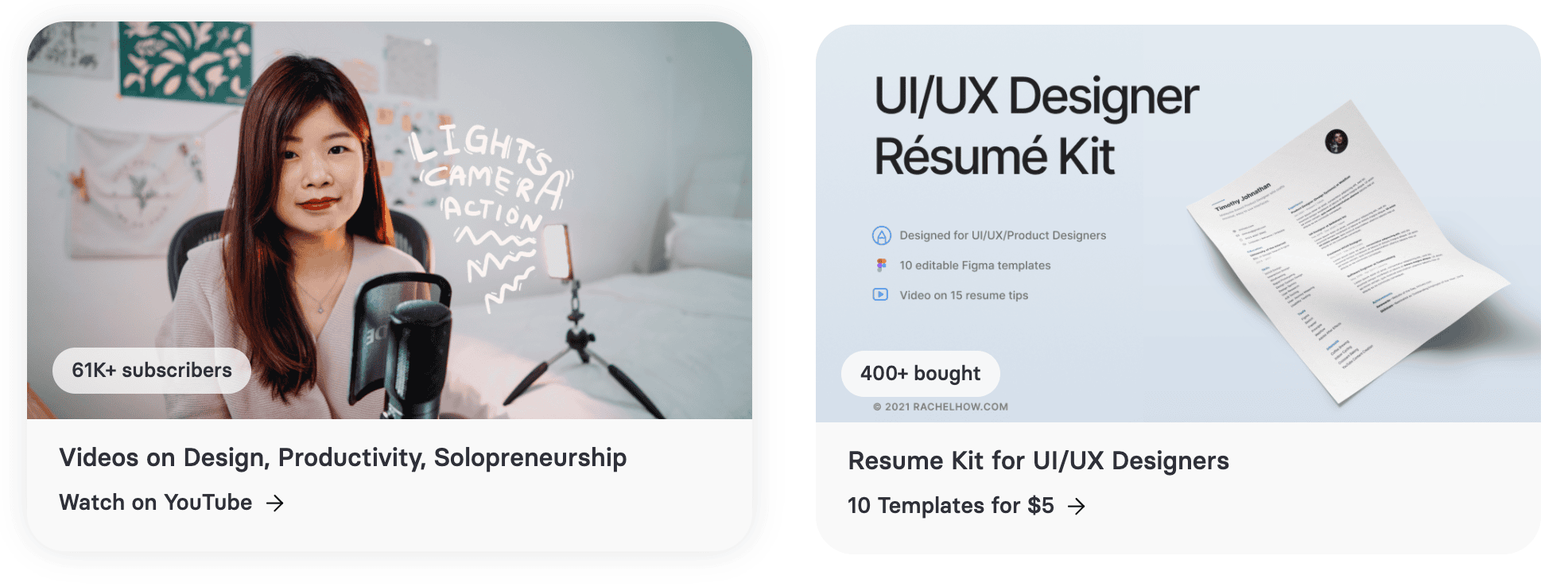
You can also add a shadow on hover, and move the element a few pixels up like in Rachel's portfolio site.

Or add an animation when your hamburger menu icon turns into a close icon, or when your arrow icon changes direction.
Summary
Frontend development is not just about coding and making things work. To deliver great UX, it takes attention to detail, consistency and a good sense of design.
Take inspiration from other websites. When you come across a website that you like, think about why you like it, and how you can apply that to your own work in the future. Keep learning, and enjoy the process!
Any tips you'd like to add? Share it with me on Twitter!

